WEBSITE DESIGN & DEVELOPMENT
Web Wizards
Websites that look sharp and sell harder.












Web Design Isn’t Extra — It’s Expected
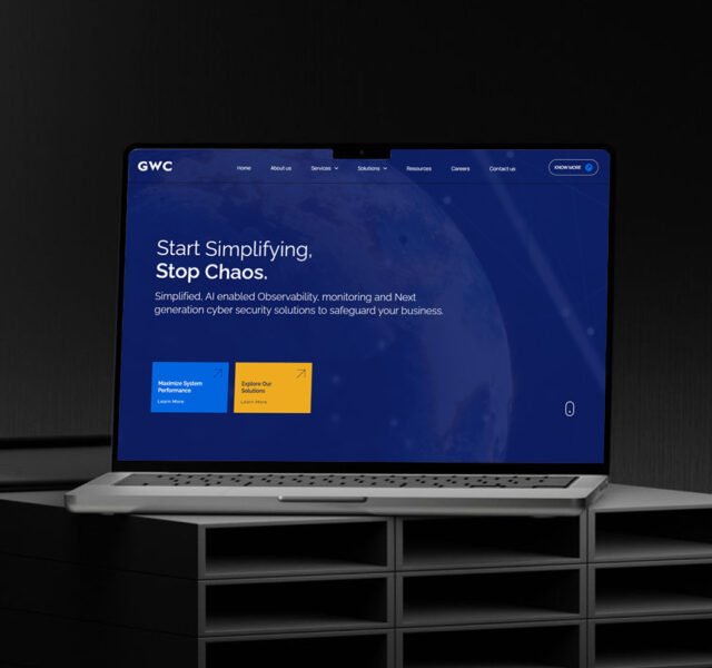
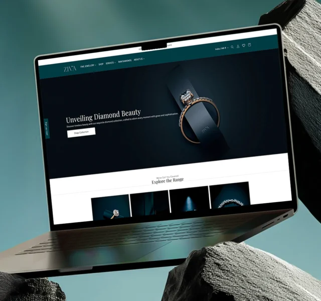
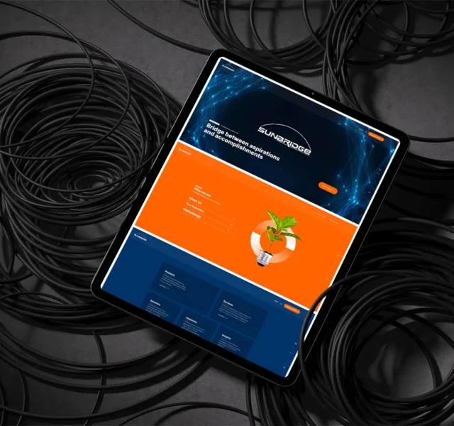
Your website is your digital handshake. It’s the first impression, the user journey, the silent salesperson. Whether you’re building from scratch or levelling up, our website design & development services help you create fast, functional, and freakin’ good-looking sites that convert.
Websites Launched
Hours Coding
Business Niches
Crafting brands that connectcaptivateconvert
Always up for a creative collab.
Our Web Approach
We don’t just design websites — we engineer scroll-stopping, goal-smashing digital HQs.
Here’s how we bring yours to life:
1. Think Phase
We get nosy. Your goals, your users, your vibe—we decode it all. No fluff, just pure digital intel.
2. Design Phase
Sexy layouts meet smart UX. We craft pixel candy that actually sells.
3. Build Phase
No janky templates. Just clean, fast, SEO-smart builds. WordPress, Shopify, Custom—we flex what fits.
4. Launch Phase
Bug-free, speed-tested, and glory-ready. We hit “Go Live” like it’s a mic drop.
Let's Build Something
Amazing Together
Our deep knowledge and experience are here to support your goals. See how our expertise can make a difference.
CUSTOM WEBSITE DESIGN
01
We don’t do cookie-cutter. Every website we design is custom-built to fit your brand vibe, your goals, and your audience. UX meets aesthetics for a site that looks sharp and sells hard.
WORDPRESS DEVELOPMENT
02
We build custom WordPress sites that are fast, functional, and freakishly easy to manage. Powered by Elementor Pro and packed with performance, your site won’t just launch—it’ll lead.
ECOMMERCE DEVELOPMENT
03
Whether it’s Shopify or WooCommerce, we build online stores that don’t just look good—they move products. From smooth checkouts to slick product pages, your shop will be scroll-worthy and sales-ready.
LANDING PAGE DESIGN
04
We design high-converting landing pages that do one thing really well—get results. Whether it’s lead gen, product drops, or ad campaigns, our pages are fast, focused, and CTA-packed.
MAINTENANCE & OPTIMIZATION
05
Your site’s live—now let’s keep it legendary. We handle the updates, speed boosts, backups, bug fixes, and tech stuff so your website runs smooth and stays stress-free. You chill. We optimize.
CUSTOM WEB APPLICATIONS
06
Got a big idea that needs more than just a website? We design and build powerful, user-friendly web apps—think dashboards, CRMs, portals, booking systems, and everything in between. Fully custom. Fully scalable. Fully badass.
We are experts in leading industry standard platforms & technologies.



The Journey
Taking you from wild ideas to epic launches!
1. Discovery Dive
Discovery Dive
01.
Get ready to plunge deep! We explore, investigate, and unearth your brand’s best-kept secrets. Armed with curiosity and caffeine, we gather insights that shape a winning strategy—turning the unknown into the unforgettable. Research never felt this exciting!
01.
Discovery Dive
Get ready to plunge deep! We explore, investigate, and unearth your brand’s best-kept secrets. Armed with curiosity and caffeine, we gather insights that shape a winning strategy—turning the unknown into the unforgettable. Research never felt this exciting!
2. Brainstorm Bonanza
Brainstorm Bonanza
02.
Ideas, ideas everywhere! We doodle, debate, and design the perfect plan, mixing wild creativity with strategic thinking. It’s an all-out creative jam session where your project’s blueprint takes shape—with a side of quirky brilliance and fun surprises.
02.
Brainstorm Bonanza
Ideas, ideas everywhere! We doodle, debate, and design the perfect plan, mixing wild creativity with strategic thinking. It’s an all-out creative jam session where your project’s blueprint takes shape—with a side of quirky brilliance and fun surprises.
3. Content Potion
Content Potion
03.
Brewed to perfection! We mix compelling words and eye-catching visuals to create content that captivates, connects, and converts. It’s not just about looking good; it’s about making magic happen—one irresistible piece at a time
03.
Content Potion
Brewed to perfection! We mix compelling words and eye-catching visuals to create content that captivates, connects, and converts. It’s not just about looking good; it’s about making magic happen—one irresistible piece at a time
4. Imagination Station
Imagination Station
04.
Hop aboard the creativity express! We dream big, think outside the box, and cook up ideas that break boundaries. Expect bold concepts, quirky twists, and a touch of unexpected genius—all designed to make your brand unforgettable.
04.
Imagination Station
Hop aboard the creativity express! We dream big, think outside the box, and cook up ideas that break boundaries. Expect bold concepts, quirky twists, and a touch of unexpected genius—all designed to make your brand unforgettable.
5. The Grand Makeover
TheGrand Makeover
05.
Your brand’s glow-up starts here! We polish, refine, and tweak every little detail until it shines. From fonts to pixels, everything gets a touch of perfection—making sure you’re dressed to impress in the digital world.
05.
TheGrand Makeover
Your brand’s glow-up starts here! We polish, refine, and tweak every little detail until it shines. From fonts to pixels, everything gets a touch of perfection—making sure you’re dressed to impress in the digital world.
6. Showtime Magic
Showtime Magic
06.
Drumroll, please! It’s time to unveil your masterpiece. We present, launch, and celebrate, ensuring your brand steps into the spotlight with style, confidence, and a little extra pizzazz. Get ready to make heads turn and hearts race!
06.
Showtime Magic
Drumroll, please! It’s time to unveil your masterpiece. We present, launch, and celebrate, ensuring your brand steps into the spotlight with style, confidence, and a little extra pizzazz. Get ready to make heads turn and hearts race!
Looking for collaboration for your next project? Do not hesitate to contact me to say hello.
